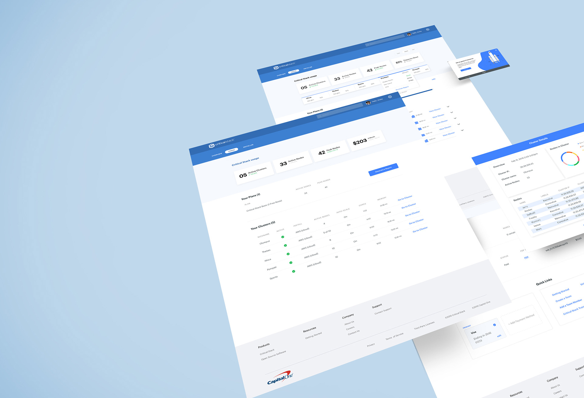
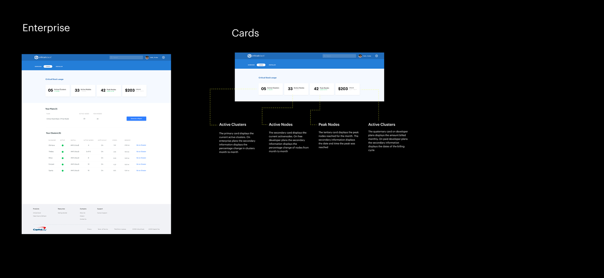
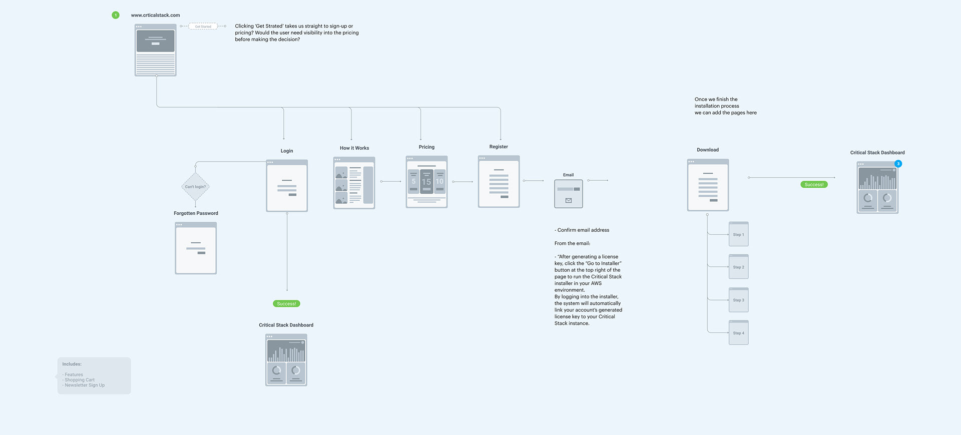
I had the pleasure of working on the Critical Stack team for a 2 month period on creating a new and consistent brand style across the 3 products they had. I mostly worked on the portal where I fixed the usage records page.
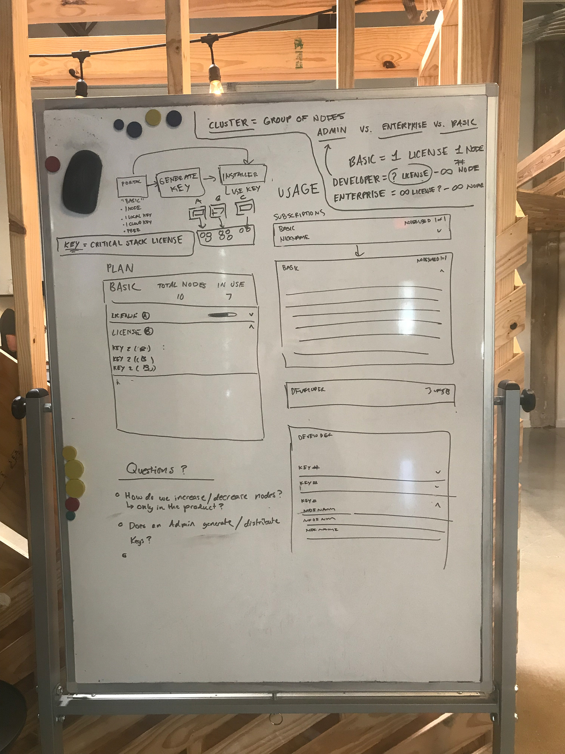
The usage records page was sent to me with little to no explanation, wanting a complete redesign. And we had to consider the Enterprise plan which was new, and had to consider what that may look like for the future. Me and the other designer on the team tried to dissect it, but we had so many questions.
Who is primarily using this page? What's the most important information? Are License key's numbers important? If the most important thing is billing and payments, how are you charging them? How does the payments differ across the three different plans?
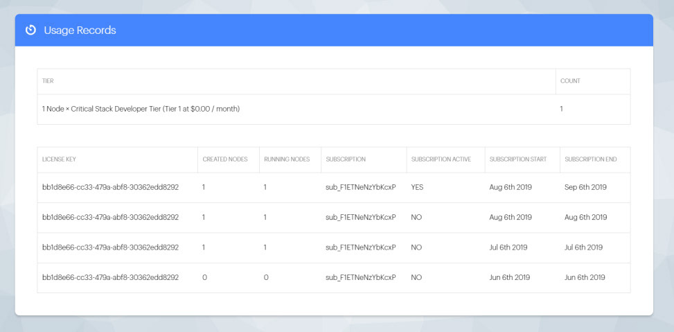
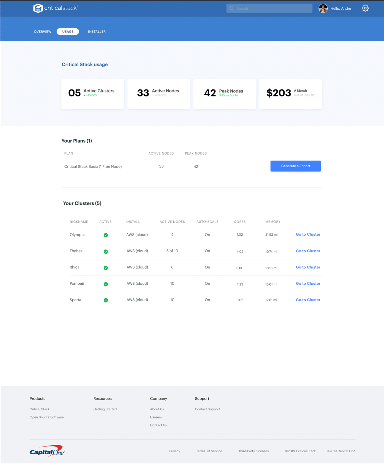
Usage Tab in Portal - Before
After getting some answers to these questions, we set off to build the first mockup. We met with them once a week to discuss our updates. Each time we learned so much and ended up at a really cool place.
Usage tab in Portal (Enterprise) - After
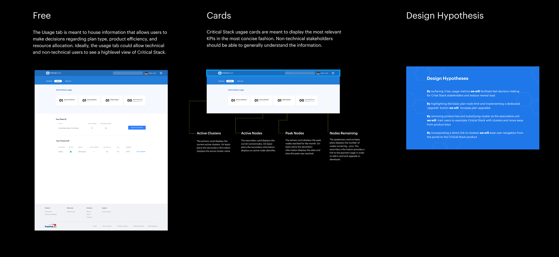
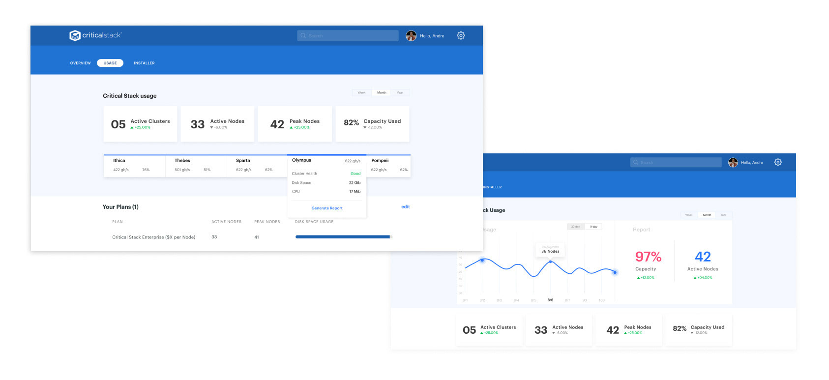
Blue sky design cluster and node health display - Usage tab in portal
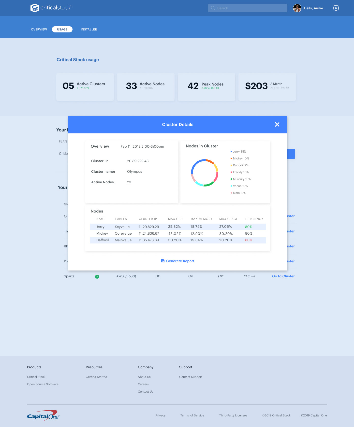
Blue Sky design - Modal collapsed
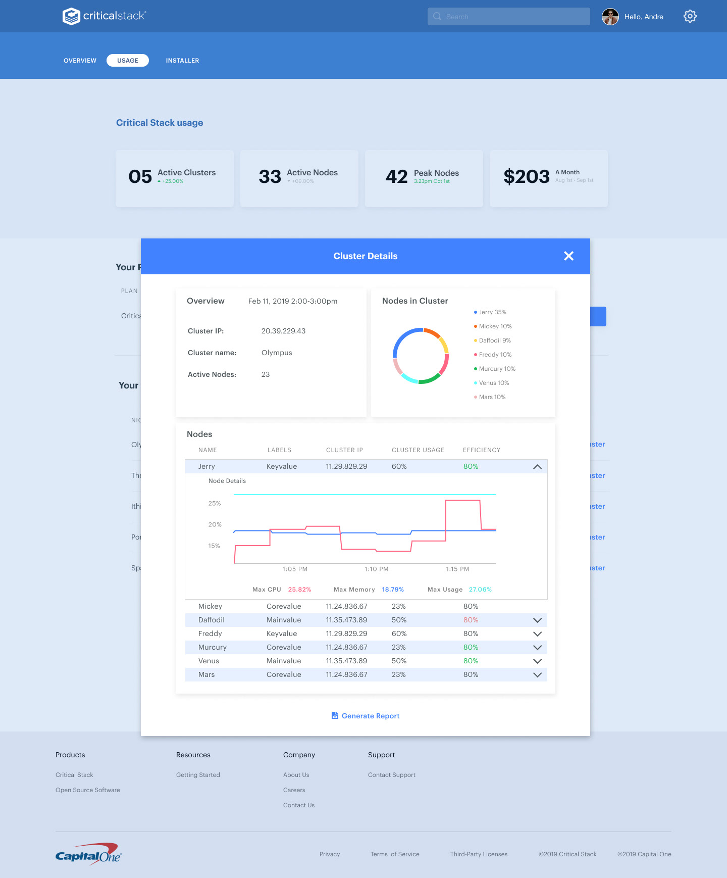
Blue Sky design- Modal expanded
Installer - Before
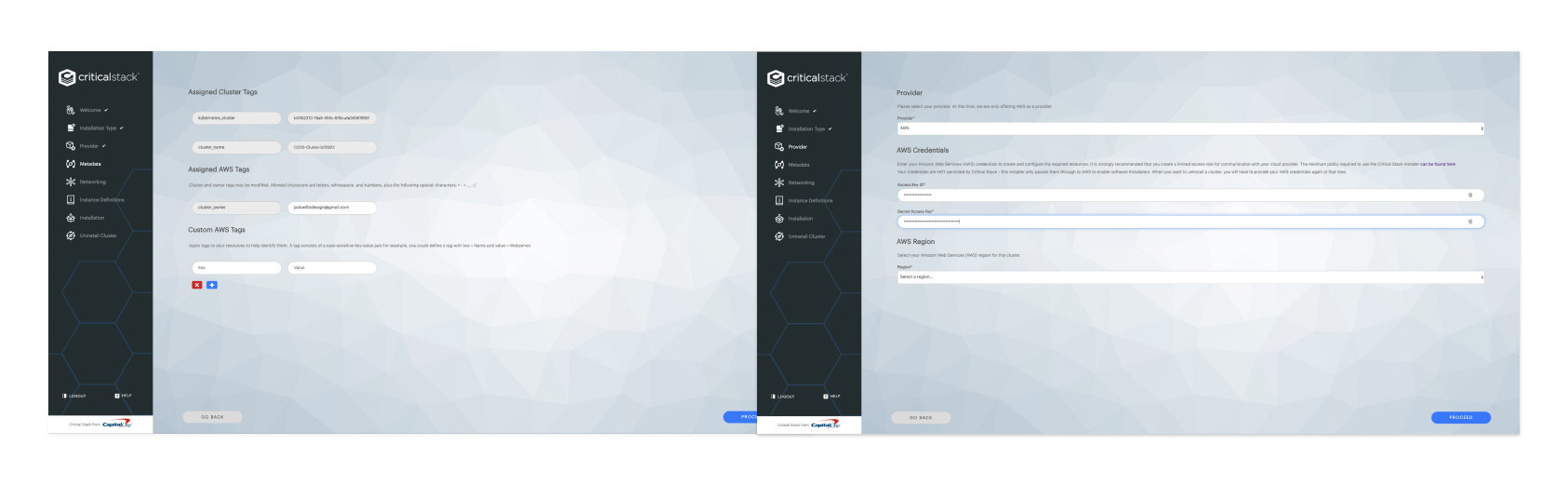
Installer r- Before
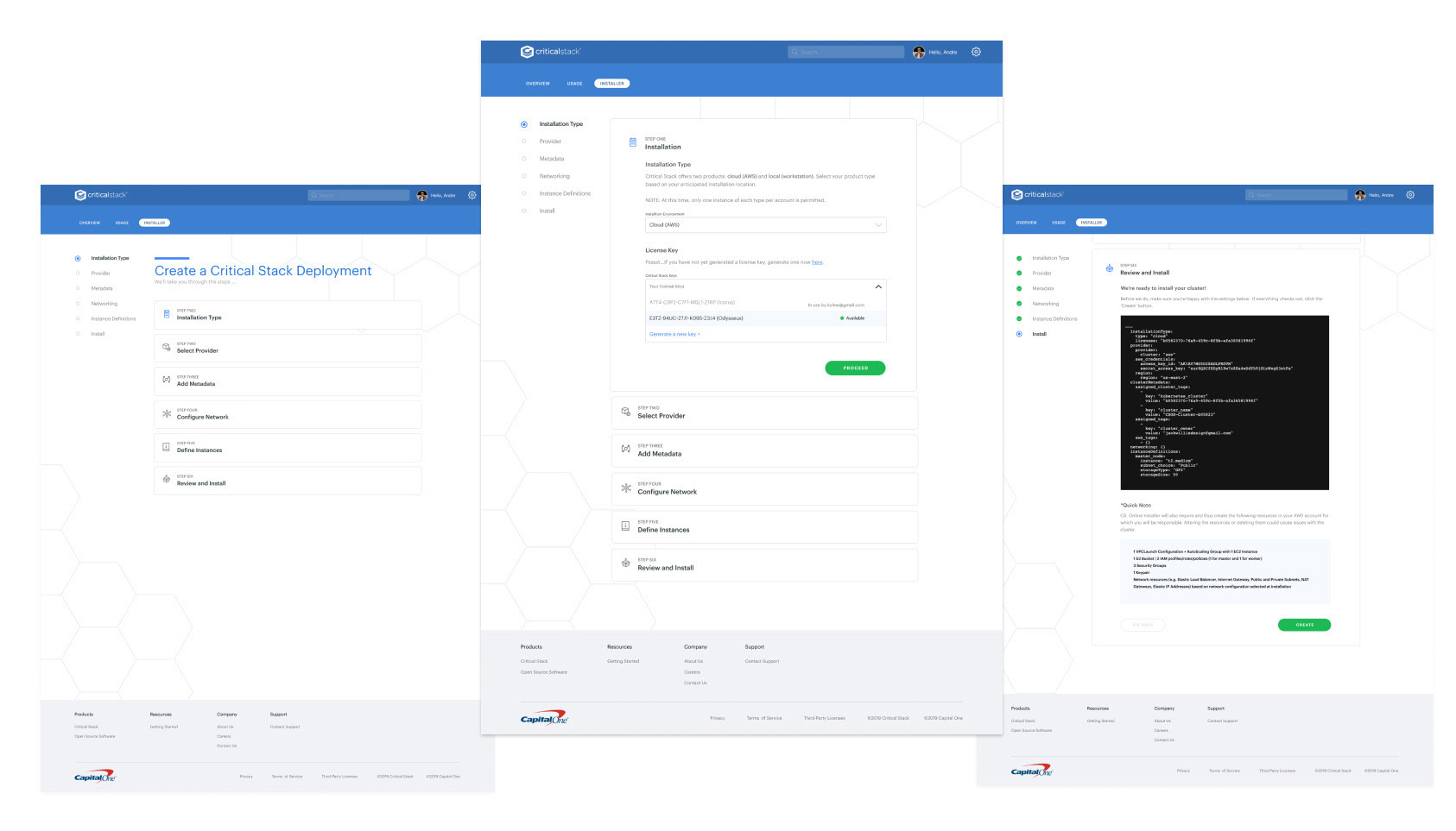
Installer - After
Animated Pricing page - Website