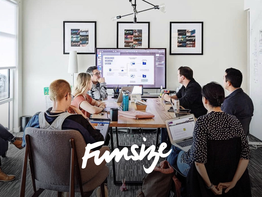
Funsize Team:
We had a lot of designers helping out with this project throughout the engagement. For the rebrand there were 2 lead designers and I joined half way through as an apprentice designer.
My work:
My main project work was visual design application. I took the concept that we decided to go with and applied it to the POS system, and the website admin section. As a collective we showed the iOS app, POS, and Kiosk what the new rebrand would look like from a digital perspective.
Team Mood Boards
We had several designers create mood boards to choose a direction. After creating team mood boards, we narrowed them down to a few concepts. We ended up at a very humanistic, bold with pattern accent, and hand drawn look. The typography adds a bit of character and humanistic traits. Toast is a brand that is for restaurants everywhere! They wanted a brand that could speak to everyone in a friendly way, that could also be applied to the digital products.
Joyful & Organic: Across the company vignettes for this theme
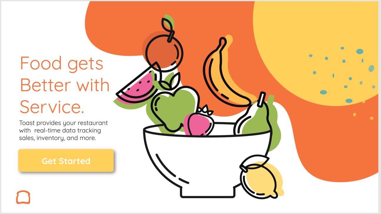
This one was mine!
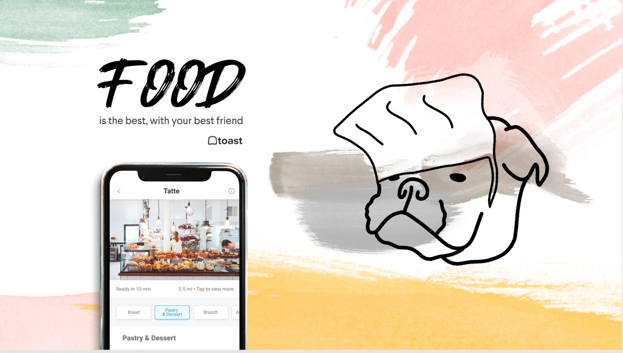
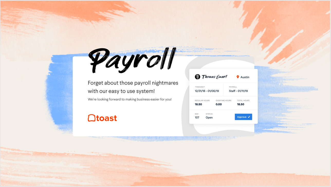
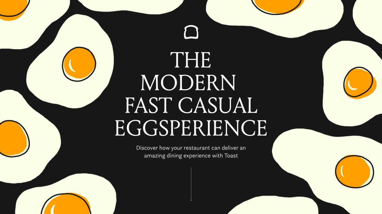
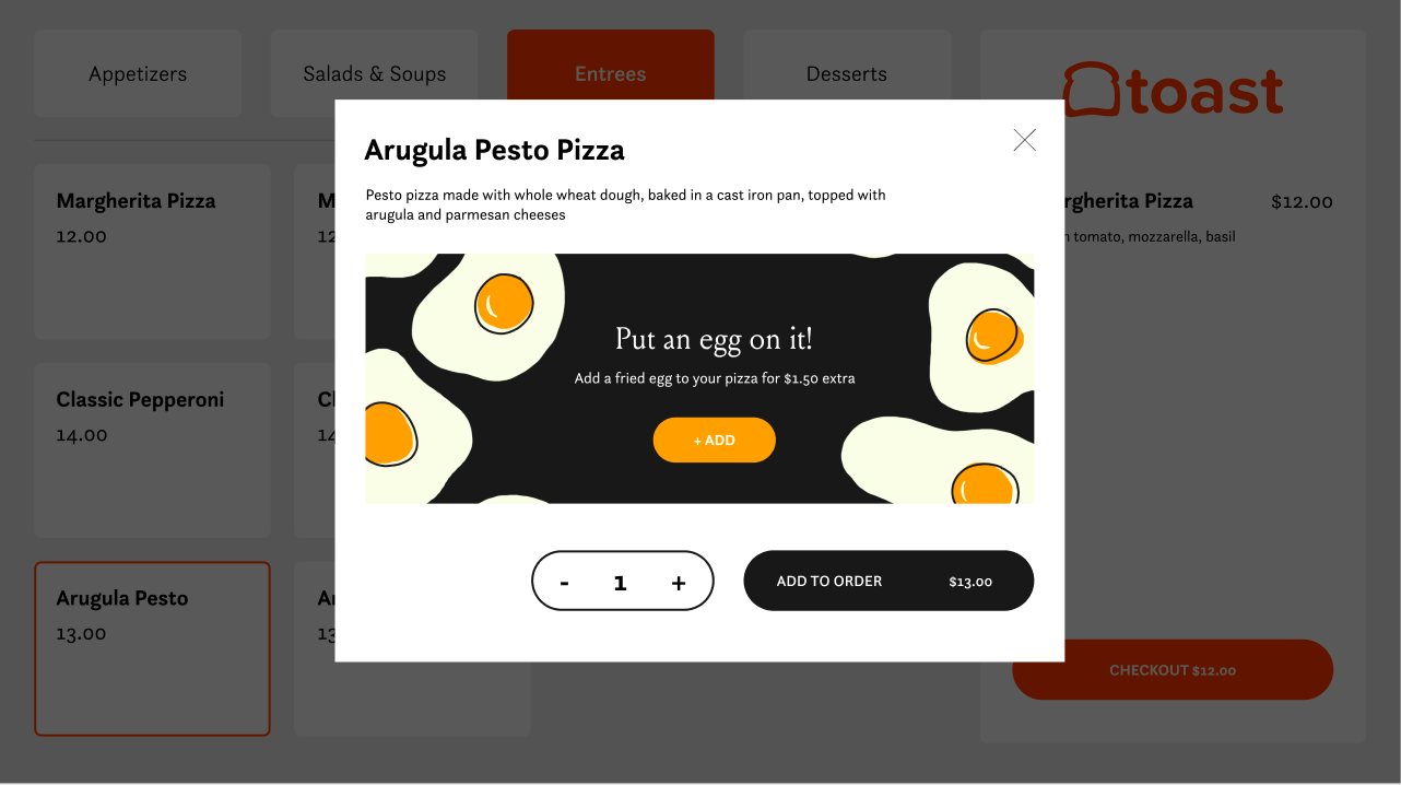
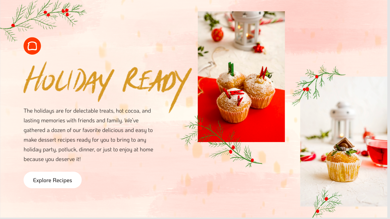
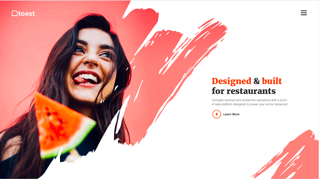
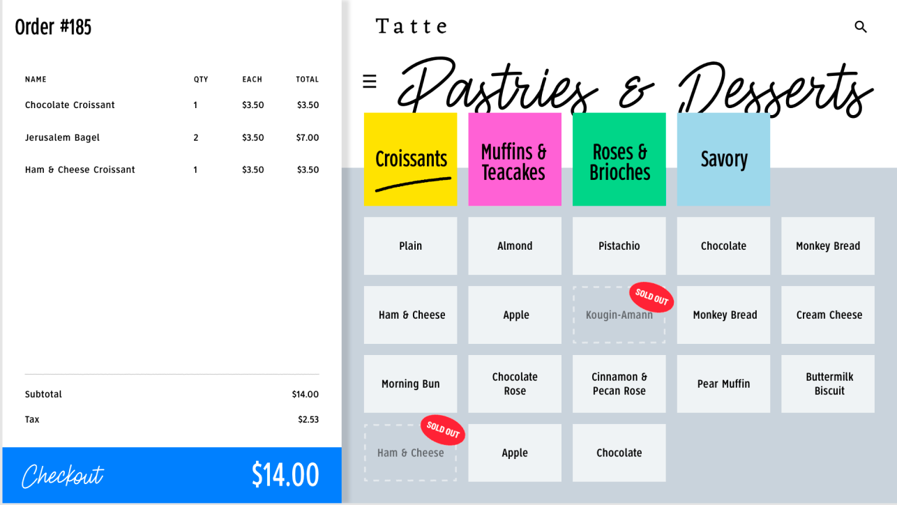
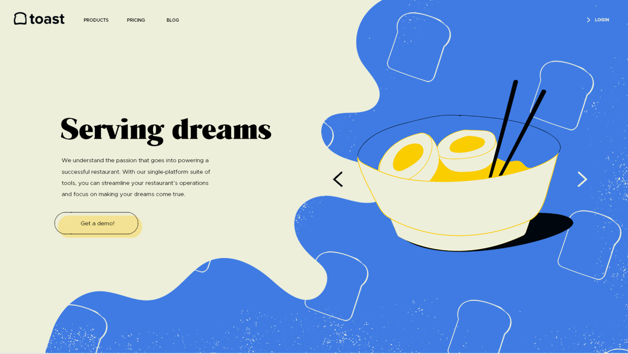
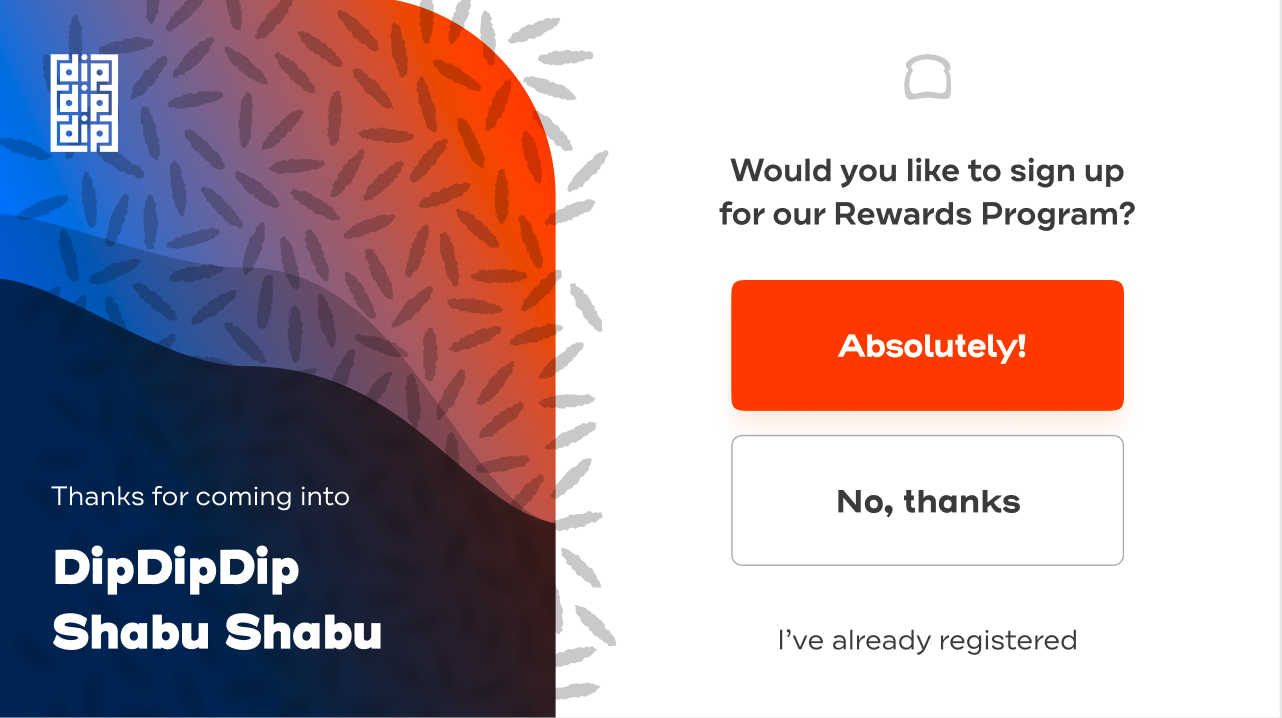
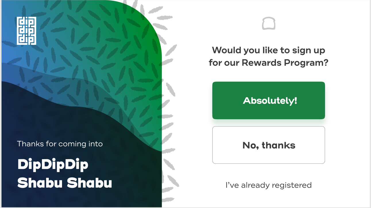
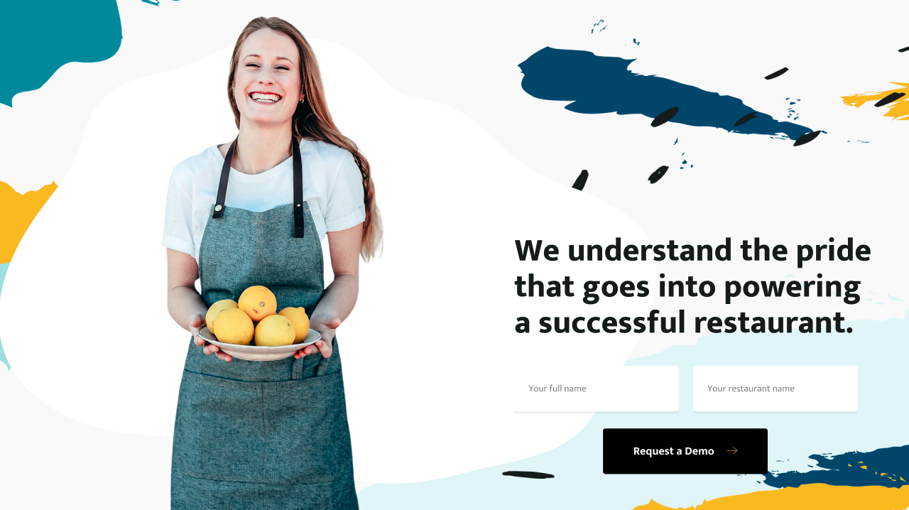
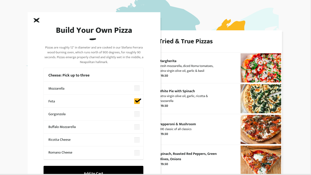
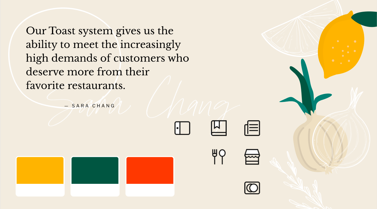
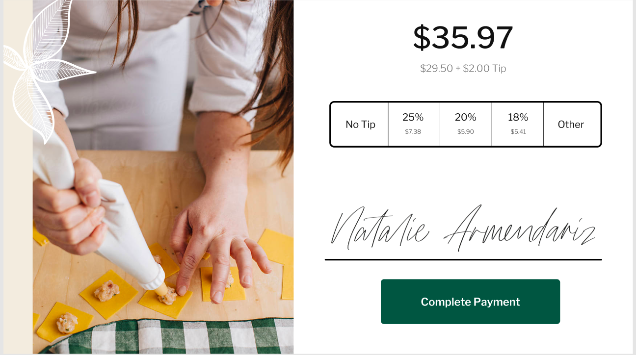
After deciding on a direction out of 2 concepts, we had to show Toast that this design could apply across the digital product as well as marketing material. It was hard to see this from the beginning because of how bright/illustrative the concept was.
Final Re-brand design:
One of our designers on my team made these visuals to help identify the pattern across platforms.
Pattern and colors across the full experience
Pattern across the experience - one of my teammates hand cut all of the fruits
My work:
I was given wireframes and told to apply the new style for POS. We had to keep the blue header consistent, and it provides a solid ground for your eye to rely on. Big bold buttons are used for easy use in a fast pace environment. All of the foods are set up into color coordinated categories that are customizable.
Toast POS system
Toast Web Menue Prototype
Handheld device packaging
