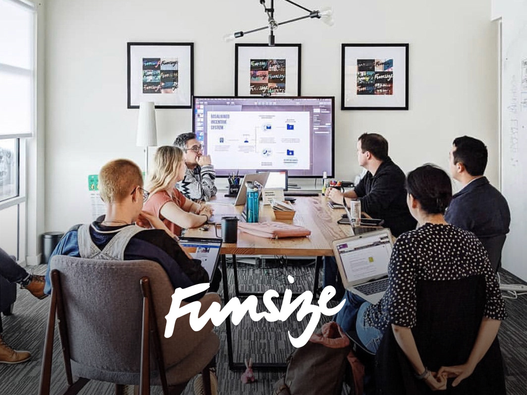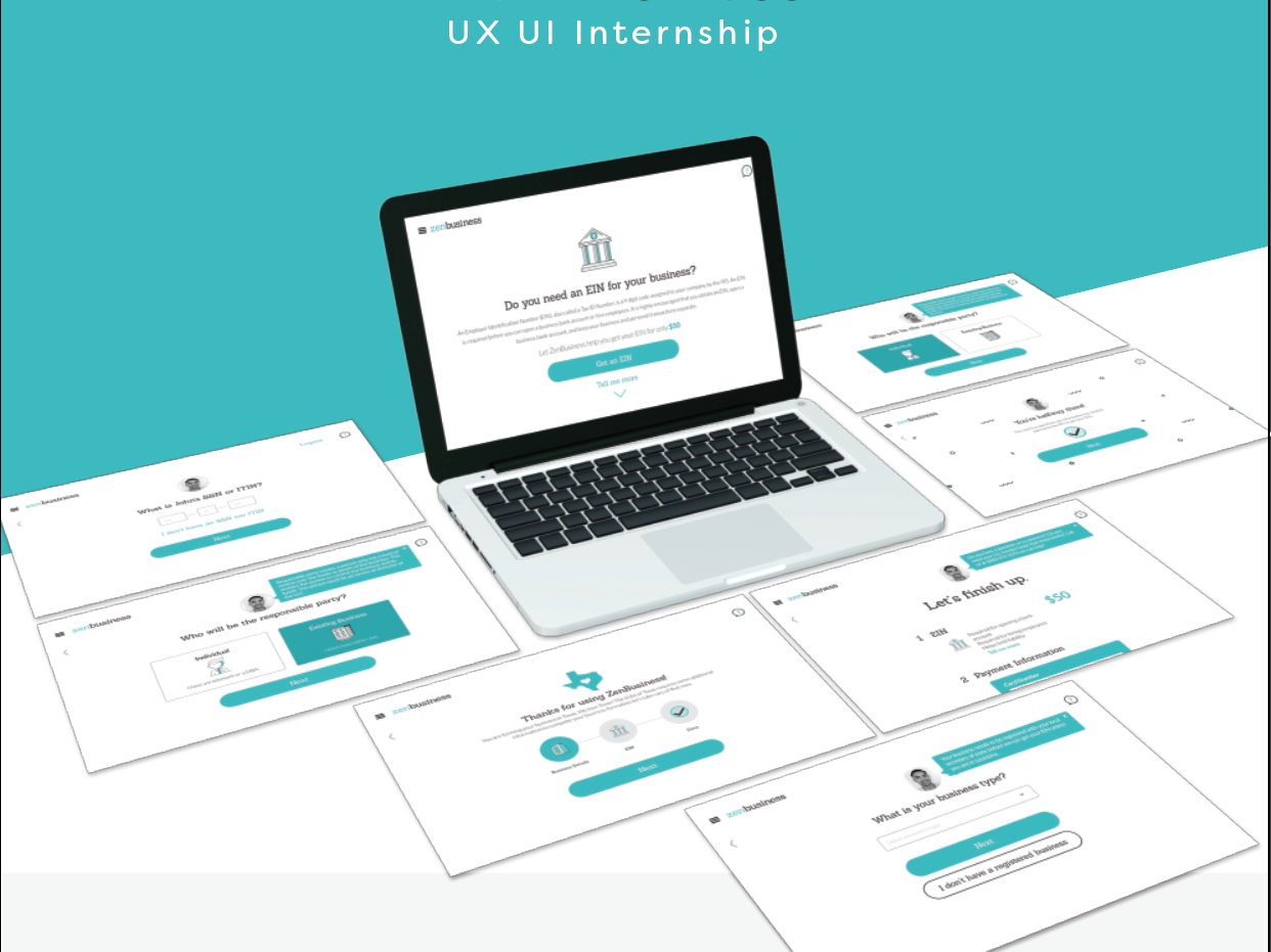
Project Scope
Company: Funsize working with client Flo Recruit
Project length: 2 weeks
Funsize Team:
Design Manager: Lindsey Rife
Product Designer: Madi Chatham
Purpose:
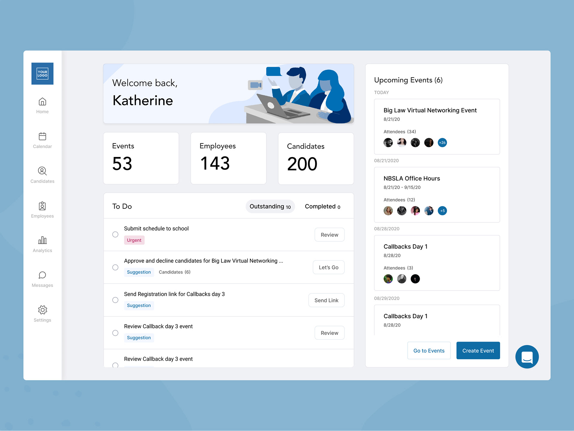
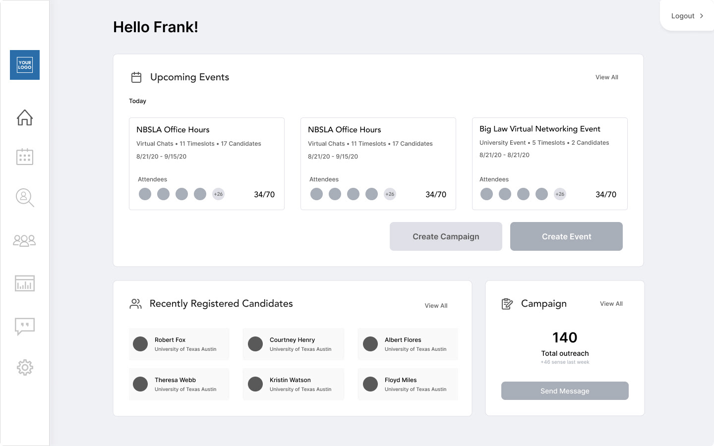
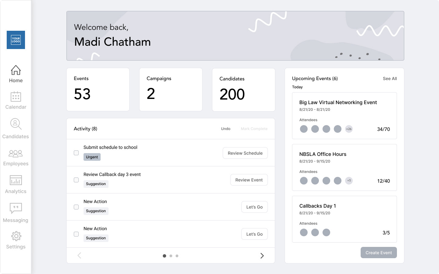
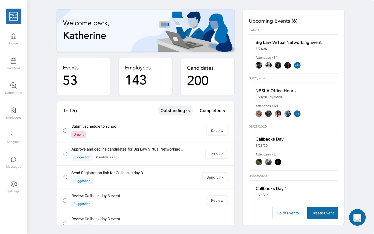
• Replace 1 on 1 product demo's with Katherine (CEO) with a homepage that will allow users know what to do next and help them analyze upcoming events. (This was most pressing because we would have 100 new registered users with a new release coming up)
• Integrate the new feature (targeted campaigns) into the analytics page and then high level in the home page. As the home page comes before the new feature, we will replace that information with the amount of "Employees" within the employers company
• Integrate the new feature (targeted campaigns) into the analytics page and then high level in the home page. As the home page comes before the new feature, we will replace that information with the amount of "Employees" within the employers company
Completion Goals:
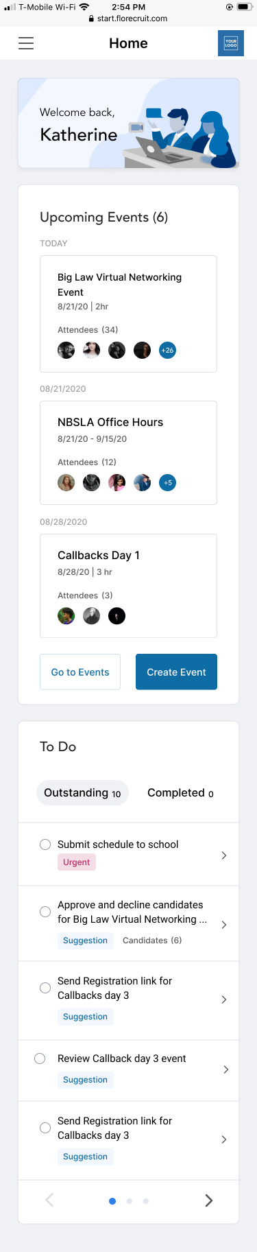
• Create a home screen for several different types of users for mobile and web
• Create space for new feature
• Create a new navigation to look better and include new pages
• Have 100 new registered law firm recruiters successfully understand product and personal tasks without 1 on 1 demo by October 30th
Discuss Project Goals
The original project pitch was to create a second recruiter tool that would focus on campaigns while the other one would focus on events. The challenge with this was understanding why we needed two separate products, and how they would use both. The pitch included the idea of toggling between accounts.
This is where I asked a lot of questions to understand the current recruiter tool, and how this would work in partnership with the student side I had been working on previously.
Do we need 2 recruiter tools? How would they toggle between the two? Can we find examples of other products that do this? Is this too confusing to the user? Can we just combine them? Which one would be easier to develop? Which way would be best for future designs and integrations?
User Flows
After analyzing the current product and new idea, I created 4 different user flows on how the log in/switching accounts/and integrated tool option would work. We would review with the dev team, management, and other designers to choose the most feasible and user friendly option.
After reviewing the flows together we decided it would be best to just integrate campaigns into the current recruiter side. (just add campaign capability) We would slowly update the UI, but initially just get the most important pages updated to integrate the new idea.

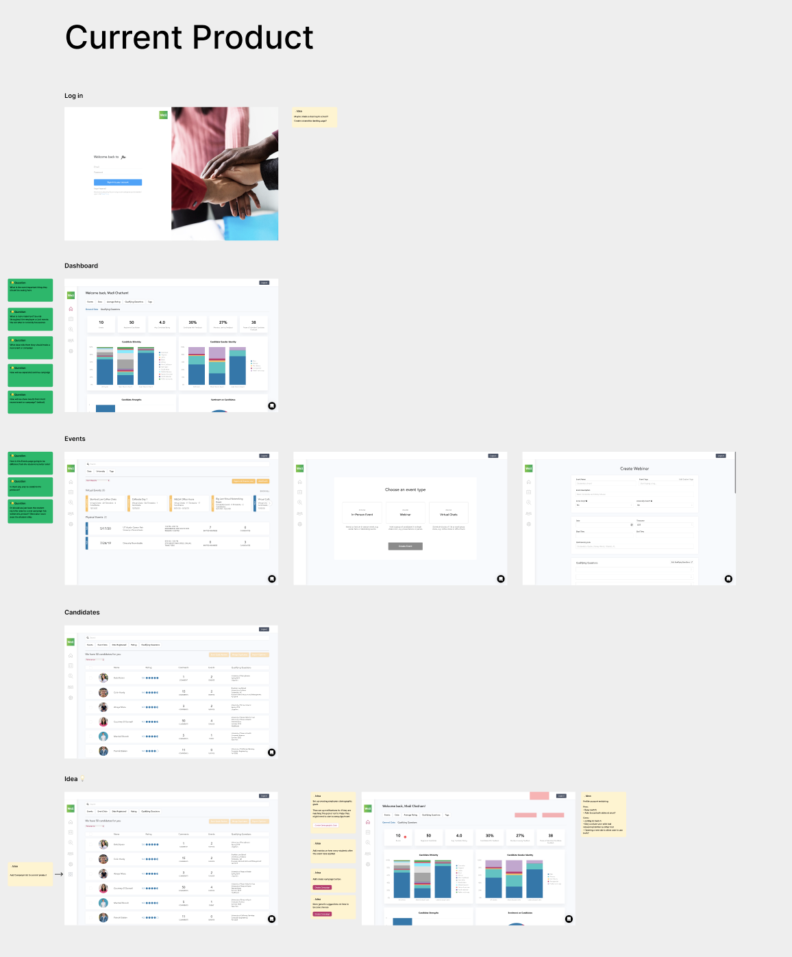
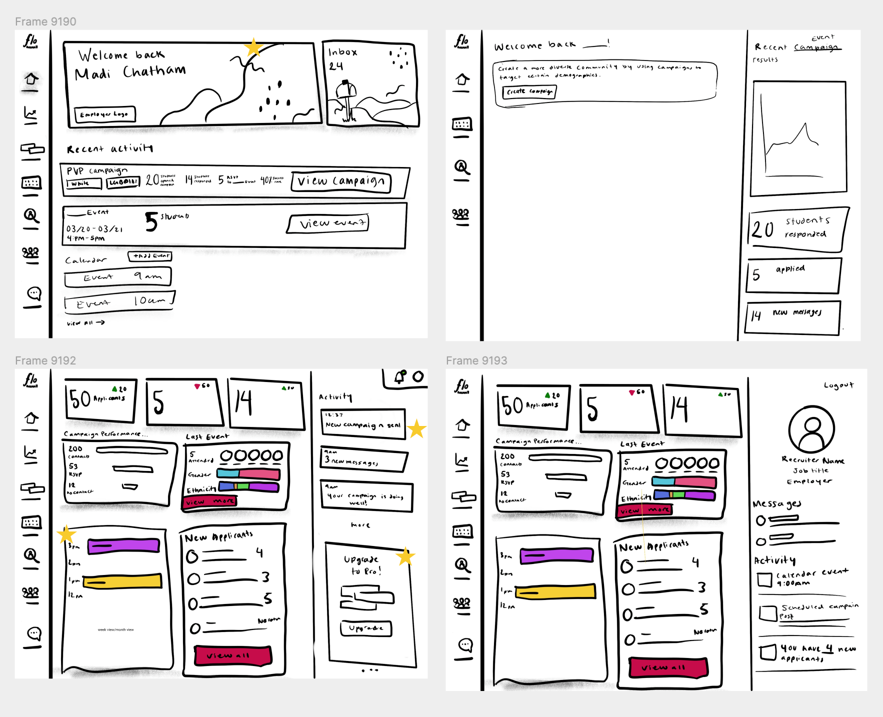
Wireframes
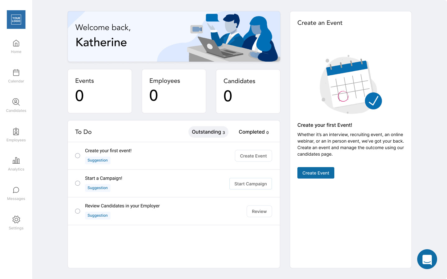
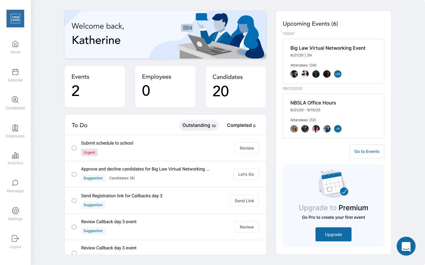
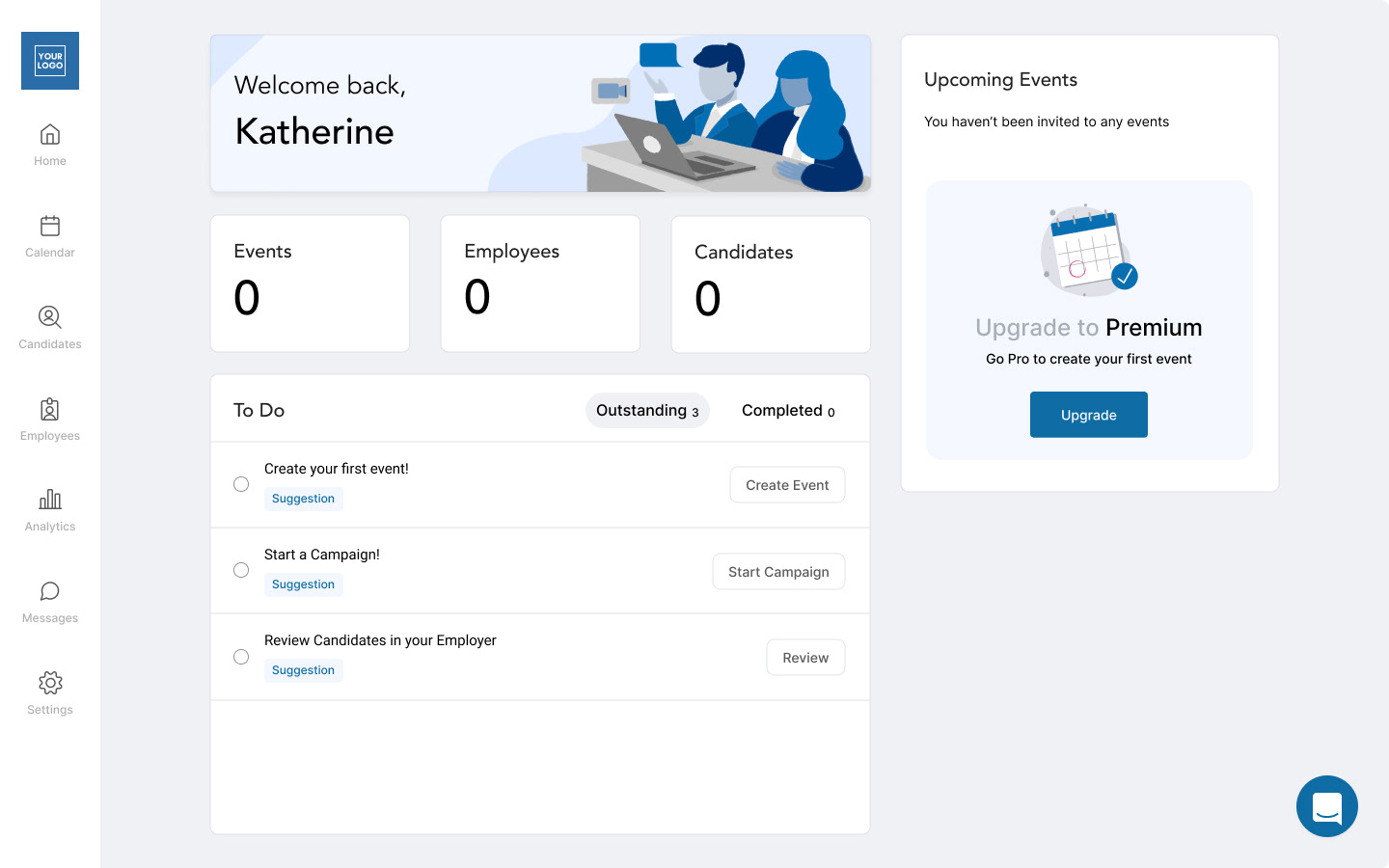
I created some sketches after looking at dashboard/home screen inspiration. After discussing the sketches I went to mocking up the layout of the pages in wireframe mode. We spent a lot of time discussing the best way to lay the page out so we could make sure that it worked for all types of users. The most valuable thing was upcoming events, and tasks or the "To-Do" section.
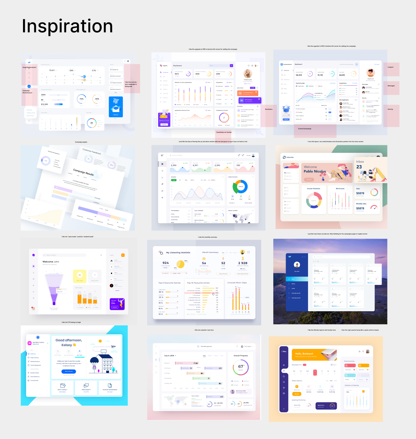
Inspiration Dashboard/Home screen
Sketches
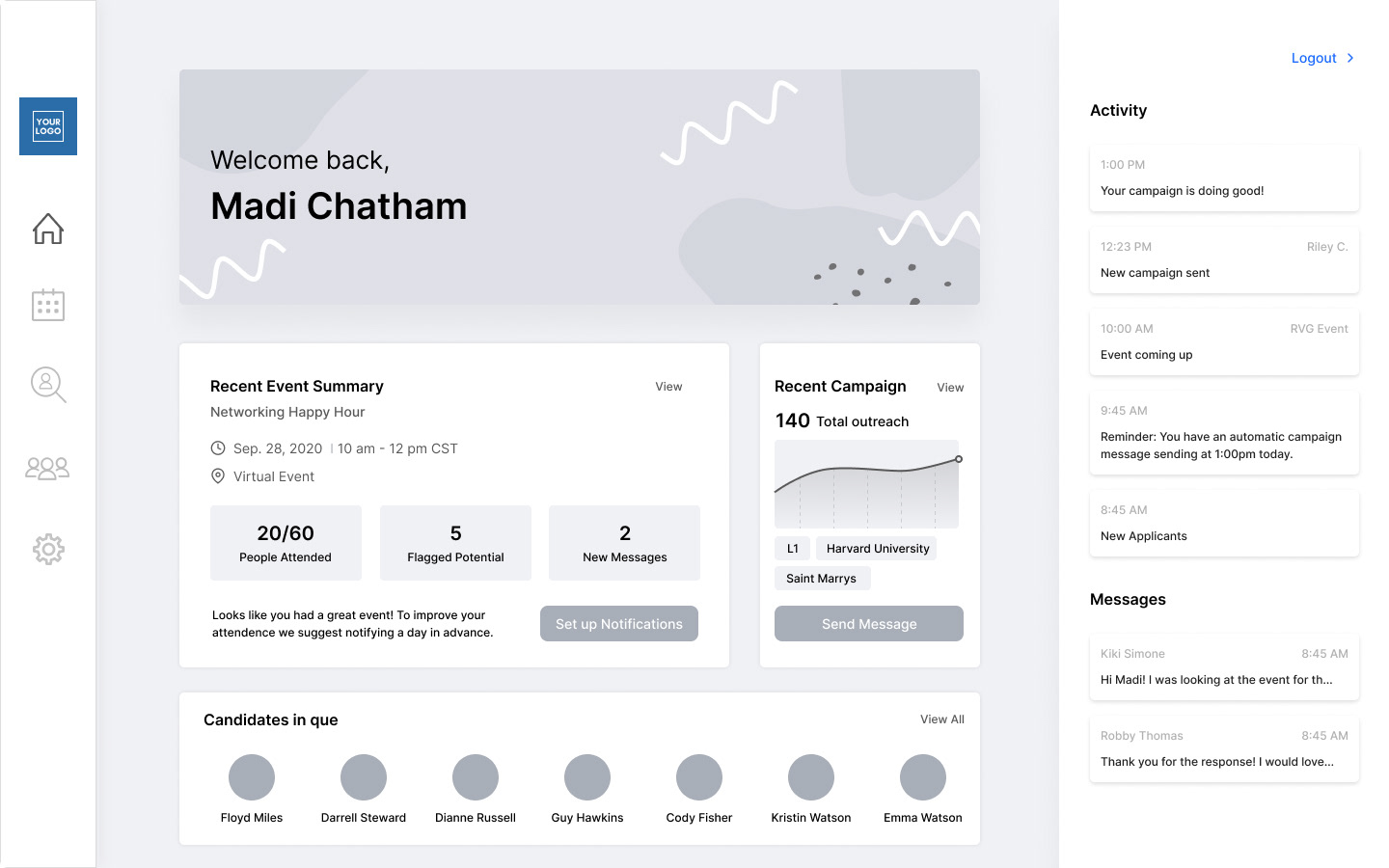
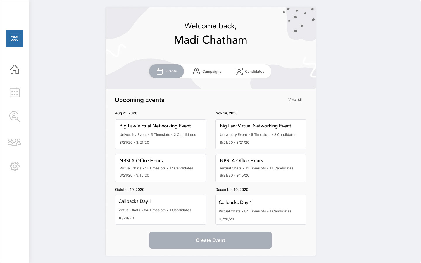
High Fidelity
Current Premium User - New Premium User
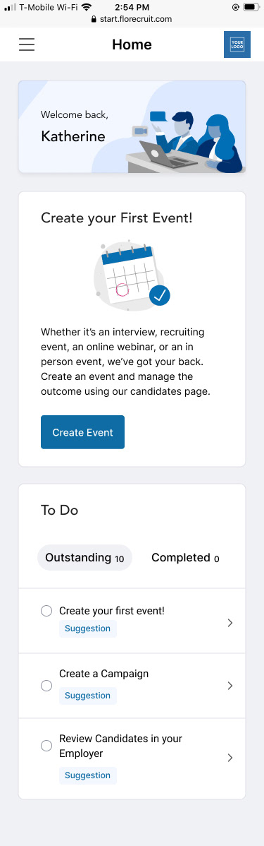
New User with events - New User no events
Landing Page Redesign
Animation For Landing Page